Is tackling in-work poverty the key for anti-poverty initiatives?
The 'low-pay, no-pay' jobs market keeps millions in poverty and holds the economy back The annual Monitoring poverty report, written by the New Policy Institute, analyses trends to tell the story of poverty in the UK today. A set of 50 indicators covers a wide range of issues, ranging from low income, worklessness and debt, to ill-health and education. The report reveals the extent of in-work poverty and the dynamic nature of poverty, caused by people cycling in and out of work and an underemployed workforce. For the first time, the report examines the impacts of the current Government’s policies on poverty and exclusion.
It also examines welfare reform: who will be affected and what the impacts will be. Monitoring poverty and social exclusion 2012 is an essential resource for policy-makers and researchers who need to understand the challenges of tackling poverty in the future. It found that:
- 6.1 million people in poverty are in working households. Excluding pensioners, in-work poverty now outstrips workless poverty at 5.1 million households.
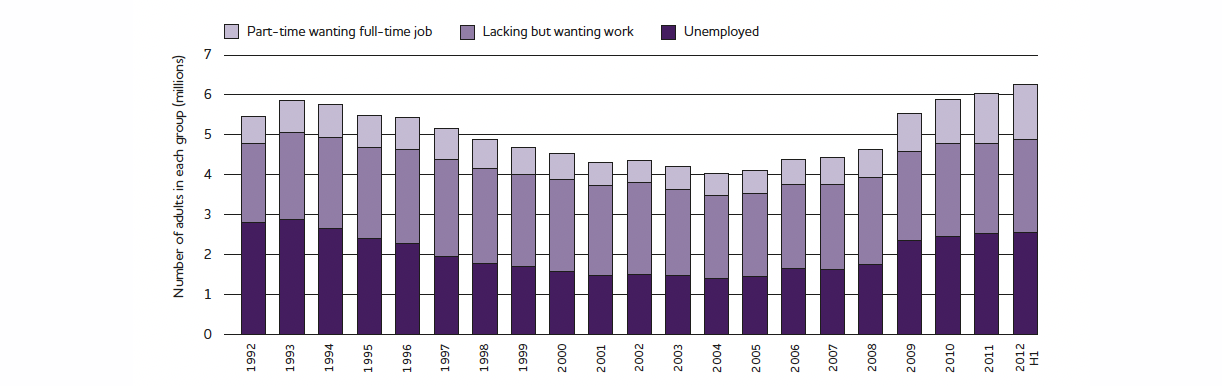
- 6.4 million people now lack the paid work they want. There are 1.4 million part-time workers wanting full-time work – the highest figure in 20 years.
- The churn of people in poverty or out of work is substantial. While 18% of people are in low income at any one time, 33% experience at least one period of low income in a four-year period, and 11% are in low income for more than half of that time.
Summary
Key points
Background
This study looks at measures of low income and deprivation. Low income (or poverty) is defined as people living in households with income below 60% of the median for that year. Poverty trends over recent decades show improvement in some areas and worsening in others. Above all they show that poverty is not inevitable; governments can influence its extent, but wider changes in society matter too.
Understanding poverty
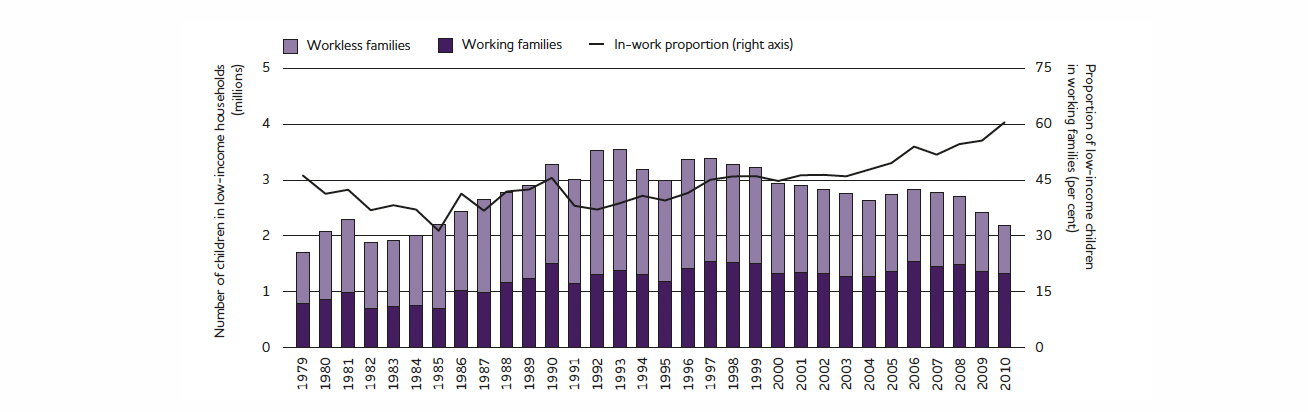
Table 1 shows the proportions of different groups in poverty (after housing costs) and how these have changed in recent decades. The poverty rate for pensioners has fallen markedly in the last twenty years; at 17%; it is now around half that of the early 1990s. Conversely, the proportion of working age adults without children in poverty has risen steadily, from 7% in 1981 to 20% in 2010/11. Child poverty rose during the 1980s to 31%, and only started falling in the 2000s.
| Proportion in low income | ||||
|---|---|---|---|---|
| Group | 1981 | 1991 | 2001/01 | 2010/11 |
| Children | 20% | 31% | 31% | 27% |
| Working-age adults with children | 16% | 25% | 25% | 24% |
| Working-age adults without children | 7% | 15% | 16% | 20% |
| Pensioners | 22% | 35% | 25% | 17% |
At the same time, the number of working-age adults in low-income, in-work households has also increased. As pensioner poverty is now at low levels, the rate of in-work poverty is the most distinctive characteristic of poverty today. Work should always be a route out of poverty but it is not.
Figure 1 – Children in poverty 1979–2010
Understanding deprivation
Positive and negative trends can be seen in other poverty-related areas. The risk of premature death is now considerably lower. Between 1990 and 2010, the probability of a man aged 55 dying before the age of 75 fell from 43% to 26%. For a woman it fell from 27% to 18%. But improvements have not been uniform. In recent years, life expectancy increases have been lower in deprived areas (see Figure 2). Previously, women’s life expectancy was at least that of men’s, regardless of an area’s deprivation, but this is no longer the case. A woman in one of the most deprived areas now has a lower life expectancy than a man in one of the least deprived areas.
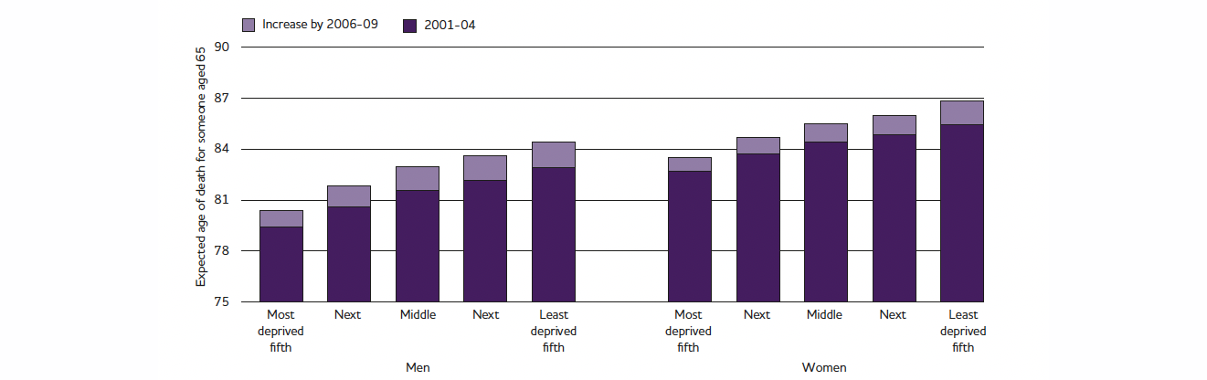
Figure 2 – Inequality in life expectancy
Over the last decade, the proportion of income spent on housing has risen most for the poorest fifth, from 26% to 29%. Meanwhile, the number of people in poverty living in social rented accommodation has fallen from 6 million to 4.2 million, while the number in private rented accommodation has doubled to reach 4 million.
Work
Other than more disabled people being in work, few other indicators are improving in this area.
Underemployment
The number of underemployed people in the first half of 2012 was 6.4 million (see Figure 3). From a low point of 4.1 million in 2004, the number has increased year-on-year, rising substantially in 2009. The 6.4 million total comprises three groups: (i) unemployed people (2.6 million); (ii) economically inactive people who want work (2.4 million); and (iii) people working part-time because they cannot find full-time work (1.4 million).
The underemployment increase since 2009 is primarily due to a rise of 500,000 in the number of people working part-time but wanting full-time work. Unemployment has remained quite static in the last three years because employees’ willingness to take fewer hours keeps it from rising.
Young adult unemployment
A million young economically active people aged 16–24 were unemployed in the first half of 2012; that is 22%, compared with 6% for those aged 25–64. The young adult unemployment rate has been rising since before the recession, and began before unemployment started increasing among the rest of the working-age population.
Unemployment dynamics
Workless people are far from a static group. Although the number of people claiming Jobseeker’s Allowance (JSA) at any one time has been around 1.6 million for the last two years, 4.8 million people claimed JSA at some point between April 2010 and April 2012. The turnover of people claiming JSA is substantial; around 42% of JSA claims from the first quarter of 2012 were made within six months of a previous claim.
Nor have currently workless people always been so. In 2012, 18% of working-age households were workless; in only 2% had no one ever worked. Over half of adults in never-worked households were under 25. So although the proportion of never-worked households has increased recently, it is likely a manifestation of high and rising young adult unemployment.
Figure 3 – Unemployment and underemployment 1992–2012
Since the 1990s, the value of benefits for children and pensioners has grown much faster than inflation, whereas the value of benefits for working-age adults has not increased above inflation since the 1970s. As a result, benefits are now much more generous for children and pensioners than for working-age adults.
At 13% in 2009/10 to 2011/12, the proportion of gross domestic product devoted to benefits is at an all-time high, but this is not the result of a long-term upward trend. Levels in the 1990s to 2008/09 fluctuated between 10% and 12%. The recession resulted in a substantial increase and the overall level has not fallen since.
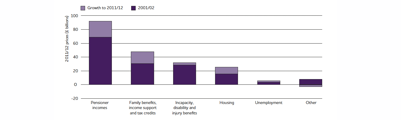
Between 2001/02 and 2011/12, spending on ‘social protection’ benefits (classified by Treasury data) increased from £156 billion to £210 billion (see Figure 4). This £54 billion growth was after inflation, a rate of 34%. At an increase of £24 billion, pensioner incomes made up the largest share of the change, reflecting their size within the budget.
Housing benefits spending grew at the fastest rate, 62%, because of increases in the number of claimants and the average cost of the benefit. Claimant numbers rose from 3.8 million in 2002 to 5 million in 2012, while average weekly benefit increased from £52 to £87. Both rises were linked to higher housing costs: as rents increased, so did the average amount of benefit to cover housing costs; also, more people were unable to afford their housing costs and became entitled to the benefit.
Figure 4 – Benefits spending
The Government has continued Labour’s programme of reforming social security, introducing a number of new policies, with more to be announced. As the welfare cuts are recent, their impact does not yet really show in poverty data. But the Department for Work and Pension’s impact assessments show that some benefit changes will produce large benefit cuts for tens of thousands (e.g. the total benefit cap for workless households), and some will produce small benefit cuts for hundreds of thousands (e.g. lowering the amount of local housing allowance claimable).
Some households, mostly already in low income, will be hit more than once through cuts to both housing-related and non-housing benefits. There is a weakness in how the Government has assessed the impact of welfare changes, by looking at them individually rather than as a whole. One reform is to replace Disability Living Allowance (designed to meet the actual costs of living with a disability) with the Personal Independence Payment, cutting the caseload by 20% in doing so. However, disabled people are more likely to be workless, so may have other benefits cut as well.
Conclusion
The Government’s key anti-poverty policies revolve around reforming the welfare system. Much is riding on the success of Universal Credit, launching in 2013. However, changing the benefits system will not solve problems such as in-work poverty, increasing underemployment and rising health inequalities.
- The composition of those in poverty is very different today than 10 or 20 years ago. The proportion of pensioners in poverty has halved since the early 1990s, while that of working-age adults without children has risen by a third.
- Over half of children and working-age adults in poverty live in a working household. In-work poverty has been rising steadily for at least a decade.
- Poverty is no longer concentrated in the social rented sector. The numbers of private renters in poverty are now as high, having doubled in the last decade.
- Health inequalities between deprived and non-deprived areas have grown in the last decade. A man in one of the least deprived areas can expect to live longer than a woman in one of the most deprived areas.
- Some 6.4 million people now lack the paid work they want. There are 1.4 million part-time workers wanting full-time work – the highest figure in 20 years.
- The populations of people in poverty and those out of work are not static. While one in six people live in low income at any one time, around one in three has had a spell in low income over a four year period.
- Similarly, while 1.6 million people are claiming Jobseeker’s Allowance (JSA) at any one time, 4.8 million have claimed JSA at least once in the last two years.
- The welfare cuts so far are likely to hit low-income households more than once, through changes to both income-related and housing benefits. Changes to disability benefit could mean low-income disabled people being hit even harder.